

Logistics Performance, Freight Excellence, and Fútbol
We are an integrated agency with an obsession to drive growth for brands. Intelligence led. Creatively inspired. People powered.
Expertise
Strategy & Insights
We think differently. Our seasoned subject matter experts strategically address immediate challenges while establishing long-term executable goals for your brand.
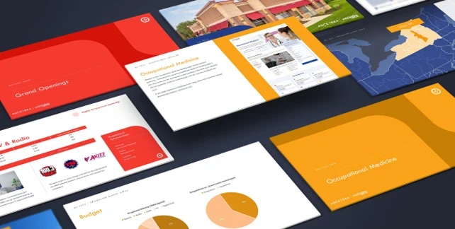
Creative Services
We are integrated. Our internal teams across the globe work as one to bring bright ideas to life. Full service, full menu, full speed.
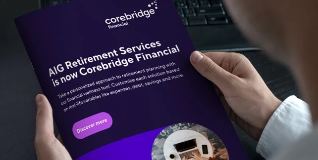
Digital Marketing
We are digital. From web development to localized campaigns, we create opportunities for our clients to adapt as their customers do, at scale.
Performance Media
We are measured. We plan, build and manage media programs with local, national or international reach. And we access revenue streams that other agencies can’t.

Warehouse Robotics

Power to Perform
Friends in high places
Insights


The Future of Enterprise and Generative AI: Part 3
Part 3 of 3: Implementing Generative AI in Marketing
Read Article


